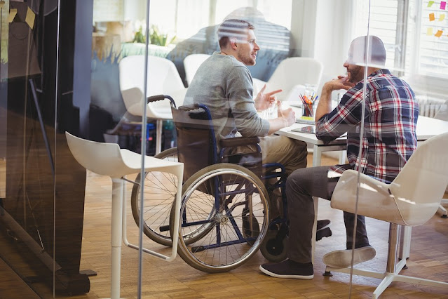
If you are planning an event or designing a space that is open to the public, you should consider how to make it more accessible and inclusive for people with disabilities.
 |
| Picture source: bowenworks.ca |
Accessibility is not only a legal requirement, but also a way of showing respect and appreciation for the diversity of your audience and community.
Here are some tips and resources to help you make your events and spaces more accessible for people with disabilities.
1. Use disability access symbols to indicate the availability of specific accommodations or services.
1. Use disability access symbols to indicate the availability of specific accommodations or services.
Disability access symbols are internationally recognized icons that convey information about the accessibility of a place or a program.
For example, you can use the wheelchair symbol to indicate that there is an accessible entrance, bathroom, or parking space; the sign language symbol to indicate that there is sign language interpretation; or the audio description symbol to indicate that there is audio description for TV, video, or film.
You can find a list of disability access symbols and their meanings on the website of the Office of Accessible Education (OAE) at Stanford University: https://oae.stanford.edu/students/resources/disability-access-symbols.
2. Provide multiple ways of accessing information and communication.
2. Provide multiple ways of accessing information and communication.
People with different types of disabilities may have different preferences and needs for accessing information and communication.
For example, some people may need large print, braille, or electronic formats of printed materials; some people may need captions, transcripts, or sign language interpreters for audio or video content; some people may need assistive listening devices or volume control telephones for hearing; and some people may need alternative keyboards, mouse devices, or speech recognition software for computer use.
You can consult with the OAE or other disability service providers to find out what options are available and how to provide them.
3. Ensure physical accessibility and safety of the environment.
3. Ensure physical accessibility and safety of the environment.
Physical accessibility and safety are essential for people with disabilities to participate fully and comfortably in your events and spaces.
You should check that there are no barriers or hazards that may prevent or limit access for people with disabilities, such as stairs, narrow doors, high counters, uneven surfaces, low lighting, loud noises, or strong smells.
You should also provide clear signage and directions to guide people to accessible routes and facilities. If possible, you should visit the venue beforehand and conduct an accessibility audit to identify and address any issues.
4. Ask for feedback and suggestions from people with disabilities.
4. Ask for feedback and suggestions from people with disabilities.
One of the best ways to improve your accessibility and inclusivity is to ask for feedback and suggestions from people with disabilities who have attended your events or used your spaces.
You can use surveys, interviews, focus groups, or other methods to collect their opinions and experiences. You can also invite people with disabilities to join your planning committee or advisory board to ensure their perspectives and needs are represented and considered.
5. Keep learning and improving your accessibility practices.
5. Keep learning and improving your accessibility practices.
Accessibility is not a one-time effort, but an ongoing process of learning and improving. You should keep yourself updated on the latest trends, standards, laws, and resources related to accessibility and disability issues.
You should also monitor and evaluate your accessibility practices regularly and make adjustments as needed.
You can find more information and guidance on accessibility from the OAE website: https://oae.stanford.edu/, as well as other online sources such as the Web Accessibility Initiative: https://www.w3.org/WAI/, or the ADA National Network: https://adata.org/.
6. Provide sufficient contrast between foreground and background.
6. Provide sufficient contrast between foreground and background.
Foreground text needs to have sufficient contrast with background colors. This includes text on images, background gradients, buttons, and other elements. This does not apply for logos, or incidental text, such as text that happens to be in a photograph.
The links below provide more information on the minimum contrast ratio as required by the WCAG and how to check contrast .
Contrast ratio is important because some people cannot read text if there is not enough difference between the text and background colors. For others, bright colors (high luminance) are not readable; they need low luminance.
7. Don’t use color alone to convey information.
7. Don’t use color alone to convey information.
While color can be useful to convey information, color should not be the only way information is conveyed. When using color to differentiate elements, also provide additional identification that does not rely on color perception.
For example, use an asterisk in addition to color to indicate required form fields, and use labels to distinguish areas on graphs.
Using color alone to convey meaning can be problematic for people who have color vision deficiencies or who use devices with limited or no color display.
8. Ensure that interactive elements are easy to identify.
8. Ensure that interactive elements are easy to identify.
One of the most important best practices for accessibility is ensuring all interactable elements, like forms, navigation menus, and social buttons, are easy to identify. There are a few ways to do this:
9. Provide clear and consistent navigation options.
- Use clear and descriptive labels for buttons and links
- Use consistent and intuitive icons for common actions
- Provide visual feedback when an element is focused, selected, or activated
- Use appropriate cursor styles to indicate interactivity
- Avoid using elements that look like buttons or links but are not
9. Provide clear and consistent navigation options.
Another key aspect of accessibility is making sure your site is easy to navigate using different methods and devices.
Some users may use keyboards, voice commands, touch screens, or assistive technologies to move around your site. To make your site more accessible, you should follow these guidelines:
10. Include image and media alternatives in your design.
- Provide a clear and descriptive page title
- Use headings and landmarks to structure your content
- Provide a skip link to bypass repeated content
- Provide a logical and consistent order of elements
- Provide a clear indication of the current location within the site
- Provide a search function or a site map for large or complex sites
10. Include image and media alternatives in your design.
Images, videos, audio clips, and other media can enhance your site's content and appeal. However, they can also pose accessibility challenges for some users who cannot see or hear them.
To make your site more accessible, you should include alternative ways of presenting your media content:
- Provide alt text for images that convey information or meaning
- Provide captions or transcripts for videos and audio clips
- Provide audio descriptions for videos that have important visual content
- Provide controls for media that starts automatically or has sound

Post a Comment for "How to Make Your Events and Spaces More Accessible for People with Disabilities"